Rightmove RentLondon
User Research, Domain Modelling, Information Architecture, Interaction Design
Brief
Rightmove was looking to generate, explore and validate new ideas to improve their property rental app. To do this faster and with less risk than using their main app and internal team, they wanted to create a separate experimental app.
Outcomes
Rentlondon was successfully launched in April 2017 and remained live until the end of the year, having fulfilled its purpose of proving an app with a better user experience could significantly improve key business metrics.
This app generated a 3x higher conversion to contacting the agent, 4x more property detail viewed, 2x better retention after 6 weeks, and 10x more users saving properties to their account.
Its learnings were key to the Rightmove product strategy over the following years.
Key challenge
We needed to understand the wider experience of renting property, including what people did before and after using property portals. Then the app needed to be designed to better support these user needs, beyond the basic search results/detail page journey.
A core unmet need was helping renters keep track of their search: which properties they have considered, applied for, visited and so on.

Design highlights
The need for speed
Research showed us renters tend to select properties to contact in a two-step process, first going through the list of matching results and selecting some as "maybes", then going through that list and looking at each in more detail before deciding to book a viewing.
We decided to allow this first preselection to be made straight from the property feed screen, without being requiried to navigate away. For this we presented the most important information at this level: several pictures, map and floorplan thanks to a scrollable carrousel, rent amount, number of rooms, location, commute time, and extras like parking and garden. We also addded a rapid interaction model of swiping at the bottom of the cards to immeditely sort the property into a saved list or removing it from the feed.
As a result, on average each user saw 4x more properties despite spending 20% less time in the app compared to the standard Rightmove app.
Help keep track of your search
A key unmet need uncovered from our Experience Mapping research was managing all the properties being considered. This was new for Rightmove as they stopped being involved once each property had been contacted. Every consumer had to make up their own system to keep track of progress, from a simple paper pad next to the desktop computer to a custom advance spreadsheet with complex sub-ratings. This previously led to mobile usage being much lower than it could have been as consumers had to wait to be at home to use their notepad or spreadsheet. Our new system of categorised groupings made the process very easy to do without needing anything else from the app.
This helps the app be used for longer into the renter journey, opening new business opportunities. Compared to the main app, rentention after 6 week was multiplied by 2.
What I did
- Deep dive with subject matter experts.
- Reviewed previous research.
- Designed and conducted consumer research through a workshop and 1 to 1 sessions.
- Co-created an initial experience map.
- Mapped out a full domain model.
- Rapid sketching.
- Prototyping and guerrilla testing, I explored new ideas and created the wireframes of the app.
Once the app was live, I conducted an ethnographic project using digital diary studies to assess how this app and competitors’ were used, and combined it with analytics to get a fuller picture, then presented the results of this initiative to the company.
Participatory workshop with London Renters,
co-creating a renters’ experience map with renters
The resulting experience map
A flow diagram explaining the core interaction journey
Domain model (partial), exploring how the various entities overlap
1 to 1 research session exploring initial features ideas
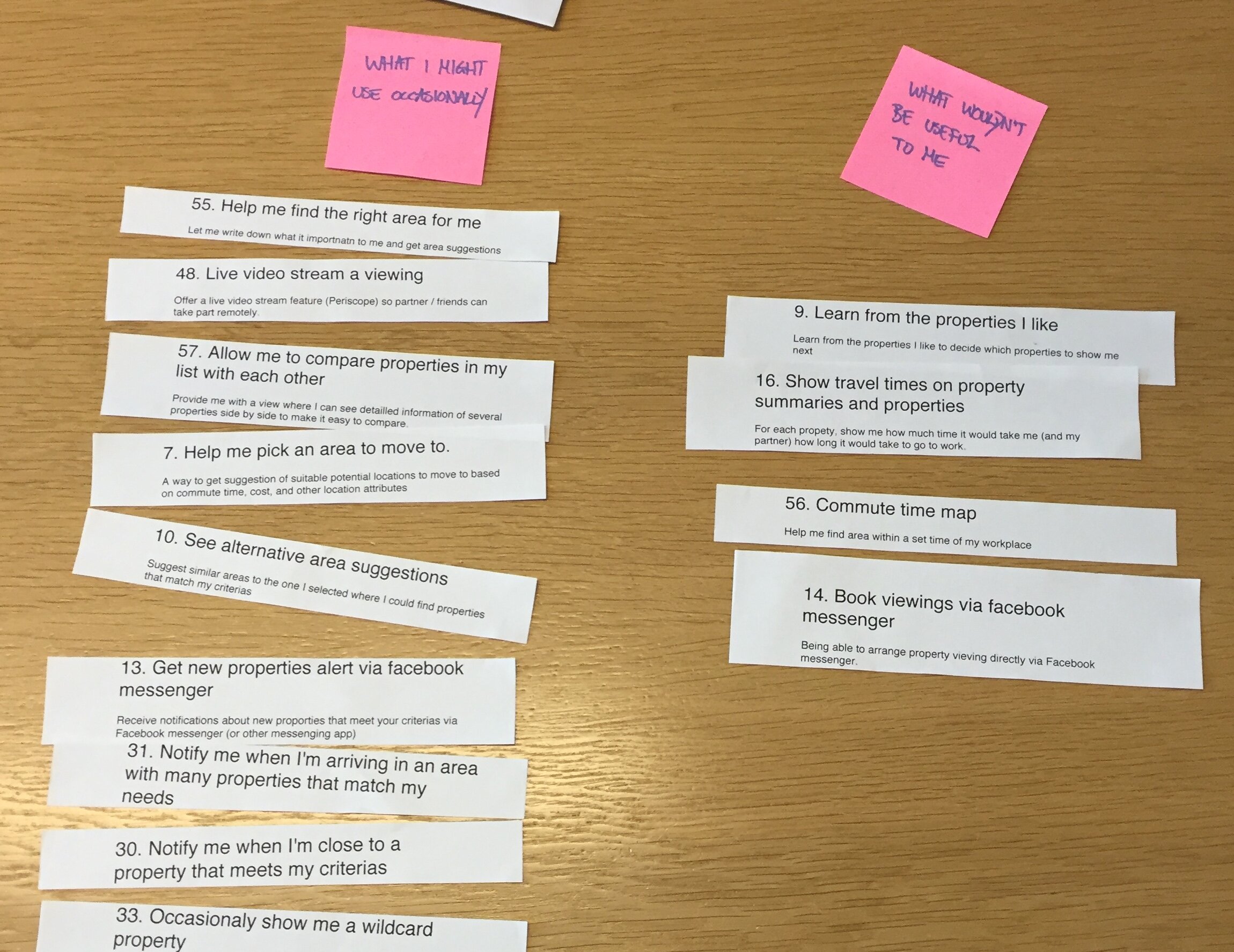
Participants sorted features into “I’d use it often”, “I might use it occasionally” and “This wouldn’t be useful to me”
The spreadsheet I used to analyse the results, providing rankings
Initial sketch
Wireframe prototype
Quick video made with Keynote to illustrate animations and transitions

Final design (made by another agency)